Table of Contents
1 | Introduction to Design Tokens
2 | Managing and Exporting Design Tokens With Style Dictionary
3 | Exporting Design Tokens From Figma With Style Dictionary
4 | Consuming Design Tokens From Style Dictionary Across Platform-Specific Applications
5 | Generating Design Token Theme Shades With Style Dictionary
6 | Documenting Design Tokens With Docusaurus
7 | Integrating Design Tokens With Tailwind
8 | Transferring High Fidelity From a Design File to Style Dictionary
9 | Scoring Design Tokens Adoption With OCLIF and PostCSS
10 | Bootstrap UI Components With Design Tokens And Headless UI
11 | Linting Design Tokens With Stylelint
12 | Stitching Styles to a Headless UI Using Design Tokens and Twind
What You’re Getting Into
A couple of days ago, my dear wife and I watched the movie Tangled. If you haven’t seen it, it’s a Disney movie based loosely on the German fairy tale “Rapunzel.”
One of my favorite scenes is when Rapunzel is early on her adventure to see a display of lateen lights at the nearby kingdom with a thief (and pretty boy) named Flynn Rider.
Flynn takes Rapunzel into what at first seems to be a charming pub with a jolly atmosphere called “The Snuggly Duckling.”
It turns out, the pub is not so charming but full of menacing thugs, including a large gentleman with a hook hand.
After finding out that there is a bounty for capturing Flynn, the thugs seek to get their hands on him. Looking on with anxiety, Rapunzel bursts forth and exclaims that she has a dream. They should let Flynn go and let her press on in her journey towards the kingdom to see the lantern lighting.
After a long pause, the thug with the hook hand bursts into song exclaiming that he too has a dream.

It is an ironic moment. All this time, you were pulled into thinking that Rapunzel would have to swing her hair and frying pan to get out of the sticky situation. Also, you definitely wouldn’t have thought that the thug with the hook hand had a dream to become greater than Mozart, but that’s how the charming tale goes.
Like “The Snuggly Duckling” and the hook-handed thug, I did not know that there was more to hex codes than a hashtag and six numbers and/or letters.
The six digits are compromised of three sets of two digits. Each set represents red, green, and blue respectively.
100% red + 100% blue + 100% green = white.
0% red + 0% blue + 0% green = black.
Given that, how do you make orange?
Well, I have no idea. I could research and give you the technical details and maybe ask Duolingo to make a special course so that you can translate all the hex codes in your codebase to your peers.
You could memorize some facts and piece them together but it’s hard.
Maybe this shows my naivety. I’m a UI developer, and I’m very creative. However, design is clearly my second language.
To be honest, I’ve never been intrigued to think about why hex codes are the way they are.
Sure, I’ll copy and paste them over and over and over again. Sure, I’ll grab a bunch of them off Coolors to make some slick animated SVG on CodePen. But, I surely won’t even stop to think about why hex codes are the way they are.
Maybe I’m digging a bigger hole in my naivety, or maybe my brain just works differently than my very talented designer friends.
My point is that it takes more than a curiosity to get me into the reasoning behind b3b3b3.
Well, I recently found that something else to draw me in.
I read a great post on why you should consider switching from hex codes to HSL values to style the color palette of your application.
HSL stands for Hue, Saturation, Lightness.
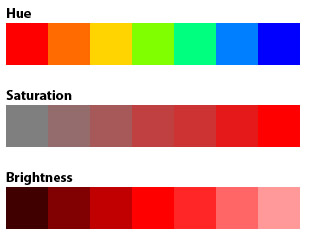
Hue is not as “huh” as the red in RGB. Hue represents the pigment of color.
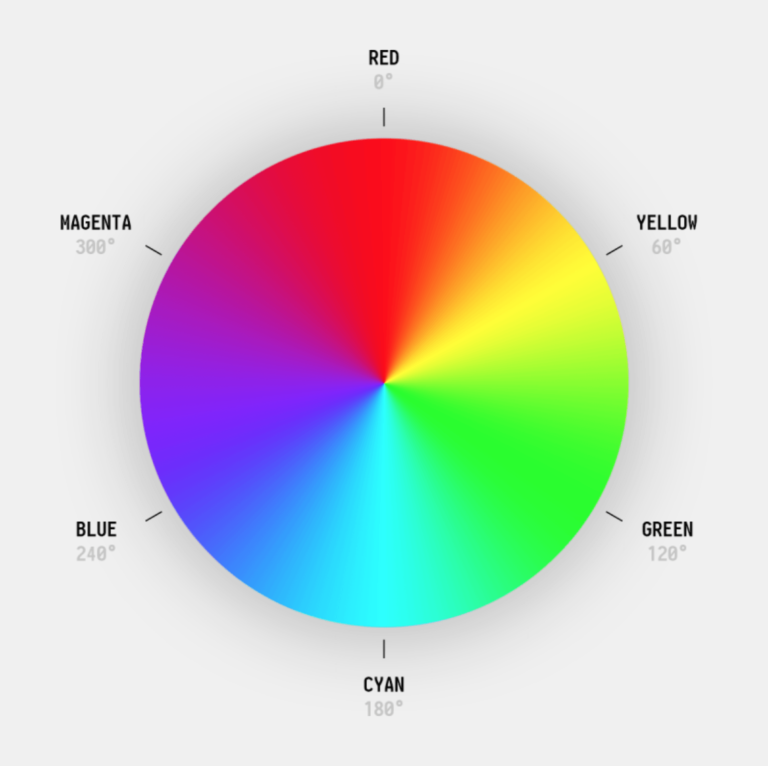
By memorizing just six ranges of degrees between 0 and 360, you can immediately get a sense of what type of color is represented by the HSL value.
Saturation is not a number representing degrees, like hue, but a percentage repainting the purity of a color. More memorably, it can be said that it represents the amount of gray pigment applied to the hue pigment.
Finally, lightness, also representing a percentage, indicates the brightness of a color. Put it another way, it represents the amount of white pigment applied to the hue pigment.

Here’s what it looks like in your CSS:
color: hsl(33, 80%, 50%);
I have to admit. This is much easier to read and think about than b3b3b3.
That’s pretty cool. But, will I take the time to think about translating these values into color in my brain? Probably not.
It’s cool if you’re brain works like that. I’m just being honest with myself.
The Possibility of Theme Shades Using HSL Values Generated By Style Dictionary
However, I did discover something that tipped me over the edge. It pulled at more than mere curiosity or tidiness.
I learned that since you can control the lightness of a color, you can create lighter (or darker) shades of all your colors by making the saturation or lightness percentage dynamic:
color: hsl(33, 80%, var(--shade));
Do you know what that means? You can toggle between light and dark mode by updating the shade, not by toggling hex codes.
Additionally, it guarantees that the dark colors in dark mode are truly the darkened version of your colors, not arbitrary light and dark color.
That’s a more minor point, however. What is more excited about is that since the dark mode is controlled by a percentage, you can have more than just light and dark mode. You can have a whole range of shades for theming your application!
Since I’ve been writing about my exploration of design tokens, I pondered on how a design token process could fit with the idea of theme shades.
Then, I remembered…
Style Dictionary exposes a transform option that can translate a hex code into an HSL value.
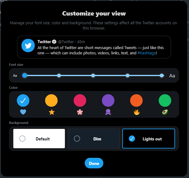
So, we can automatically generate theme shades such as dim and lights out (using Twitter’s terminology) while providing just the light theme’s color palette as hex codes in the design file.
We also can generate the 000-900 shades of color automatically. 🙀
In this article, we’ll learn how to take hex codes from a Figma file and translate them into design tokens representing theme shades.
Creating The Color Palette
In a previous article, I wrote about creating a process to export a JSON file representing the design tokens from a Figma file into a Style Dictionary repository using the Design Tokens plugin.
However, to make things easier for this article, I created a simple JSON file representing design tokens for a color palette from scratch, following the “Category/Type/Item” format:
// design-tokens.json
{
  "color": {
    "background": {
      "page": {
        "primary": {
          "value": "rgba(152, 94, 255, 1)",
          "type": "color"
        },
        "secondary": {
          "value": "rgba(0, 179, 166, 1)",
          "type": "color"
        },
        "error": {
          "value": "rgba(176, 0, 32, 1)",
          "type": "color"
        }
      }
    }
  }
}
I’ve mentioned this “CTI” format earlier in this series, but I’ll give a quick breakdown of this JSON file.
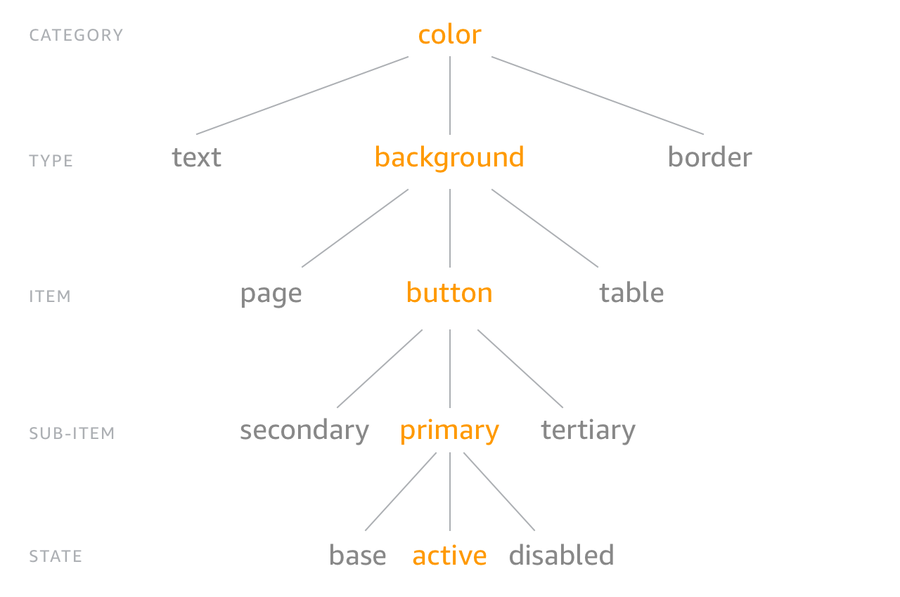
In the blob above, color is the category, background is the type, and page is the item. Meaning, the specified colors are for styling the background color of pages in an application. primary, secondary, and error are the different “sub-items,” or variants. I didn’t include a state.
Generating The Shades From Our Design Tokens Using Style Dictionary
The Setup
For now, copy the JSON blob above and save it as a file on your machine called design-tokens.json.
Before we do something with it, it’ll make things easier to have an automated process to transform our hex code colors to HSL colors using Style Dictionary whenever the design-tokens.json file is updated in a style dictionary repository.
Also, we’ll want automation to deliver the HSL deliverables to a sample repository containing a React app where we can attempt to wire-up the theme shades.
As I’ve written about before, we can achieve that automation by using GitHub Actions.
You can fork my style-dictionary repository and create a new branch off of the consuming-design-tokens-from-style-dictionary-with-github-actions branch.
I’ve named this branch after the title of this article: generating-design-token-theme-shades-with-style-dictionary
Basing off of this branch will allow us to pick up where I left off in my previous article.
Our branch on that repository contains an NPM package that has the Style Dictionary CLI as a dependency. It also contains an input folder with a design-tokens.json file which we’ll replace with the new one we just saved.
Lastly, it contains the GitHub Actions workflows that will run the Style Dictionary CLI to transform the design tokens into platform deliverables. After that, it will deliver the platform deliverables to any specified consuming applications.
What We’ll Code
Given this, we’ll need to first update the Style Dictionary config (found in config.json) to transform the color palette design tokens from Figma into CSS variables with HSL values, including all the theme shades.
Then, we’ll update the GitHub Actions workflows to fit our needs, allowing the theme shades to be delivered to a React app.
After that, we’ll be in good shape to kick off this automation by replacing the input/design-tokens.json file in our style dictionary with our new one.
Finally, we’ll update the React app to test out creating theme shades from the HSL color tokens.
Transforming The Hex Code Tokens to HSL
First things first, we’ll modify the config.json file to only create a single platform deliverable called _variables.css that will be written to the output folder:
{
  "source": ["input/**/*.json"],
  "platforms": {
    "css": {
      "transformGroup": "css",
      "buildPath": "output/css/",
      "files": [{
        "destination": "_variables.css",
        "format": "css/variables"
      }]
    }
  }
}
You’ll recall that a “transform group” is a group of pre-defined “transforms,” or steps, to convert the design tokens to a common platform deliverable.
In our case, the css transform group generates CSS variables that can be consumed by an application.
Checking the Style Dictionary documentation, we can see that the pre-defined css transform group performs the following “transforms:”
attribute/cti
name/cti/kebab
time/seconds
content/icon
size/rem
color/css
The color/css transform seems to be relevant to understanding how the exported design tokens will represent our colors.
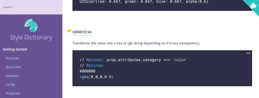
It turns out that this transform will export the color design tokens as a hex code, or a rgba.
rgba is the same type of red, green, blue coloring as a hex code but with a number between 0 and 1 driving the transparency.
Appropriately, the transform uses rgba if it detects transparency in the original color design tokens.
Checking the documentation again, we can see that there is another transform called color/hsl.
Sweet, that’s just what we need! 🎉
It will transform a color value in the JSON file representing the original design tokens to an HSL value, or HSLA if there is transparency.
Under the hood, the color/hsl transform just calls the toHslString method exposed by a library called Tiny Color.
Since the transform groups are just cherry-picked transforms, we can cherry-pick our own transforms in place of using a pre-defined transform group.
In our case, we can add a transforms list in the config.json replacing the transformGroup: "css".
It will have all the documented transforms of the css transform group except that we’ll swap out color/css for color/hsl:
{
  "source": ["input/**/*.json"],
  "platforms": {
    "css": {
-      "transformGroup": "css",
+      "transforms": ["attribute/cti", "name/cti/kebab", "time/seconds", "content/icon", "size/rem", "color/hsl"],
      "buildPath": "output/css/",
      "files": [{
        "destination": "_variables.css",
        "format": "css/variables"
      }]
    }
  }
}
After saving those changes, let’s make sure that the .github/workflows/deliver-tokens-to-consumer.yml file has the correct settings so that our transformed color tokens will be delivered to the correct consuming application.
Here is a starter for an application we can consume: https://github.com/michaelmang/design-token-theme-shades
Now, let’s update the workflow to commit the transformed color tokens to the consuming application.
Here is what the changes looked like for me (you’ll need to tweak the GitHub settings with your own repository and info):
name: Deliver Tokens To Consumer

on:
  push:
    paths:
      - 'output/**'

jobs:
  # Add a job for every additional consumer/application
  deliver_to_react_application:
    runs-on: ubuntu-latest
    steps:
    - uses: actions/checkout@v2
    - name: Deliver Platform Deliverable To Application
      uses: andstor/copycat-action@v3
      with:
        # See documentation: https://docs.github.com/en/actions/reference/encrypted-secrets
        # Set the secret in the "src" repository
        personal_token: ${{ secrets.API_TOKEN_GITHUB }}
        # This is the branch that has the code for this article
-       src_branch: consuming-design-tokens-from-style-dictionary-with-github-actions
+       src_branch: generating-design-token-theme-shades-with-style-dictionary
-       src_path: output/scss/_variables.scss
+       src_path: output/css/_variables.css
        dst_owner: michaelmang
-       dst_repo_name: consume-style-dictionary-github-actions
+       dst_repo_name: design-token-theme-shades
-       dst_branch: main
+       dst_branch: implement-shades
-       dst_path: tokens/_variables.scss
+       dst_path: tokens/_variables.css
        username: michaelmang
        email: mikemangialardi94@gmail.com
        commit_message: Update platform deliverable
Let’s commit and push our changes so far.
Now that the automation will work as expected, we can push our new design-tokens.json file that we saved earlier.
When the design-tokens.json file is pushed to our latest branch on the style dictionary repository, we
should see the GitHub Actions workflows do their work.
First, transforming and exporting the received design tokens file into the transformed color tokens with HSL values in a _variables.css file.
Second, delivering the platform deliverable to our consuming application on a implement-shades branch.
Now, let’s push the design-tokens.json file we saved earlier to the style-dictionary repository and see if it works.
You can investigate the “Actions” tab for that repository on GitHub to see the results of the workflows, but the ultimate check is to make sure that the consuming application got the color tokens:
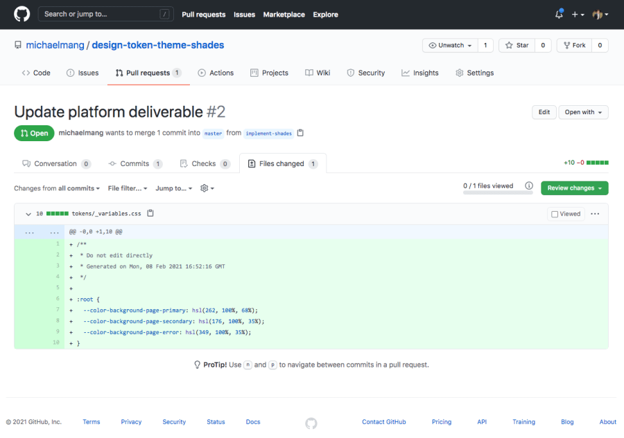
Awesome, there is a commit with the color tokens with HSL values to represent the colors. 🎉
Utilizing the HSL Values to Generate Shades
It’s cool that we can transform our RGB values or hex codes into HSL values using Style Dictionary.
However, it would be even cooler if we could leverage Style Dictionary to do an additional transformation to create a range of shades for each color.
Let’s do that next.
What I’m picturing is that we add a new transform to our transforms list in the config.json file of our style dictionary repository.
It doesn’t look like there is a pre-defined transform that can generate shades from an HSL value. However, Style Dictionary offers the flexibility to register a custom transform.
When Style Dictionary builds, it parses the design tokens in your JSON file. Any property within the JSON object that contains a nested value property is internally referred to as a “prop.”
Each registered transform in Style Dictionary is represented as an object:
StyleDictionary.registerTransform({
  name: "time/seconds",
  type: "value",
  matcher: function (prop) {
    return prop.attributes.category === "time";
  },
  transformer: function (prop) {
    return (parseInt(prop.original.value) / 1000).toString() + "s";
  },
});
The example above shows how you can register a custom transform with some Node code.
A transform is an object containing a name, type, matcher, and transformer property.
The pre-defined transforms are also simple objects that follow the same structure.
The matcher and transformer functions provide you a prop which is a design token represented as an object:
{
  prop: {
    value: 'hsl(262, 100%, 68%)',
    type: 'color',
    original: { value: 'rgba(152, 94, 255, 1)', type: 'color' },
    name: 'color-background-page-primary',
    attributes: {
      category: 'color',
      type: 'background',
      item: 'page',
      subitem: 'primary'
    },
    path: [ 'color', 'background', 'page', 'primary' ]
  }
}
The blob above is what we would get if we registered a custom transform in our build process and had the matcher or transform function just log the provided prop.
It is on the “prop” that Style Dictionary does its transforms.
At the end of your chain of transforms, Style Dictionary ultimately formats/translates all your “props” into the platform deliverable. In our case, each prop is formatted into a CSS variable.
This means that to add another CSS variable, or whatever platform deliverable you are working with, you need to add a new prop.
A limitation of transforms is that you can’t clone props.
In a word, we can’t use a transform for generating our shades.
The good news for us is that Style Dictionary does allow you to access the non-transformed properties in Node.
There is another library called tinycolor2, a color manipulation library that Style Dictionary uses under the hood for its color transformations.
We can do the color/hsl transform manually using this library (as there would be no other way to have access to the transformed props all at once before the build).
Then, we can take each color and generate shades by manipulating the HSL values.
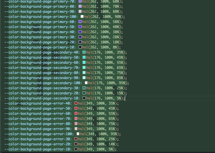
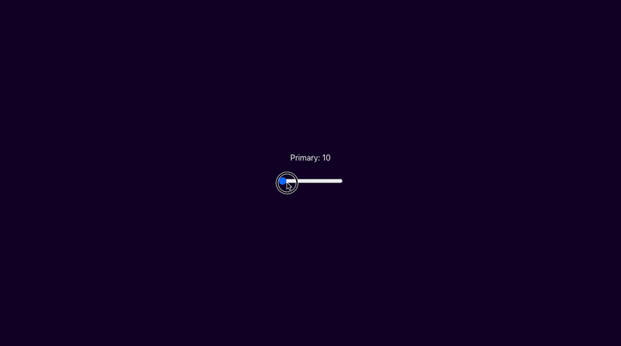
A simple algorithm to do this is to tweak the “lightness” from the HSL value. Recall, lightness is the third number in the HSL value. It represents the percentage of white pigment to be applied to the “hue”, the first number. When the lightness increases, we are creating a lighter shade. When the lightness decreases, we are creating a darker shade.
We want to generate as many shades as we can by offsetting the lightness by 10%.
Since the lightness can be anywhere between 1% and 99% (given that 0% is always black and 100% is always white), we can increase the lightness by 10% as long as it is below 100%.
Once we can no longer increase the lightness without exceeding 99%, we will decrease the lightness by 10% from the original value. We do this until the next decrease would be below 1%.
For example, if the lightness was 50%, we would be able to increase by 10% a total of 4 times before another increase would exceed 99%:
original-shade: 50%;
lighter-shade-1: 60%;
lighter-shade-2: 70%;
lighter-shade-3: 80%;
lighter-shade-4: 90%; // + 10% would be 100% which is > 99%
By the time we can no longer increase, we have 5 shades in total. Therefore, we can create 4 darker shades by decreasing the lightness by increments of 10% before another decrease would fall below 1%:
darker-shade-1: 10%;
darker-shade-2: 20%;
darker-shade-3: 30%;
darker-shade-4: 40%;
original-shade: 50%;
lighter-shade-1: 60%;
lighter-shade-2: 70%;
lighter-shade-3: 80%;
lighter-shade-4: 90%;
We can open our style dictionary and create a new file called build.js:
// build.js
const StyleDictionary = require("style-dictionary").extend("./config.json");

StyleDictionary.buildAllPlatforms();
In the code above, we are using the importing StyleDictionary as a module in a way that will allow us to extend the configuration found in config.json.
At the bottom, the StyleDictionary.buildAllPlatforms() will do the equivalent of doing style-dictionary build on the command line.
Now that we’re extending Style Dictionary, we’ll do the build by running this Node file in place of using the CLI:
// package.json
 "scripts": {
-   "build": "style-dictionary build"
+   "build": "node build.js"
 },
Additionally, we’ll have to remove the automate color/hsl transform since we will do it ourselves:
transforms: [
  "attribute/cti",
  "name/cti/kebab",
  "time/seconds",
  "content/icon",
  "size/rem",
- "color/hsl"
],
Next, let’s install install tinycolor:
npm i tinycolor
We can replace the contents of build.js with the following:
const StyleDictionary = require("style-dictionary").extend("./config.json");
const tinycolor = require("tinycolor2");

// increase the lightness by 10%
// tinycolor represents the percent as a decimal between 0 and 1)
// for example: hsl(262, 100%, 68%) is represented as { h: 262, s: 1, l: .68 }
const OFFSET = 0.1;

// the new color properties to replace the original ones
// recall, the original ones are in `design-tokens.json`
let shades = {};

// round to the highest range
// for example: .62 rounds to .70
function roundUp(num, offset = OFFSET) {
  return Math.ceil(num / offset) / 10;
}

// since tinycolor represents the percent as a decimal, translate the decimal to the percentage
function asPercent(num) {
  return num * 100;
}

// appends the shade percentage to the key
// for example: primary + { h: 262, s: 1, l: .68 } becomes primary-70
function asShadeKey(key, lightness) {
  return `${key}-${asPercent(roundUp(lightness))}`;
}

// convert the object representing the hsl back into a string
// for example: { h: 262, s: 1, l: .68 } becomes hsl(262, 100%, 68%)
function asHslString(ratio) {
  return tinycolor.fromRatio(ratio).toHslString();
}

// add a new color property for the generated shade
function cloneShade({ hsl, key, lightness, prop }) {
  const shadeKey = asShadeKey(key, lightness);
  shades[shadeKey] = {
    ...prop,
    value: asHslString({ ...hsl, l: lightness }),
  };
}

// the original color properties
const colorProps = Object.entries(
  StyleDictionary.properties.color.background.page
);

for (const [key, prop] of colorProps) {
  // convert any color into a hsl object
  const hsl = tinycolor(prop.value).toHsl();

  // extract the original lightness before we manipulate it
  const { l: originalLightness } = hsl;
  let lightness = originalLightness;

  // add a property for the original shade
  cloneShade({ hsl, lightness, key, prop });

  // add a property for a lighter shade (higher lightness percentage)
  // until another lighter shade would go above 99%
  while (lightness + OFFSET < 1) {
    lightness = lightness + OFFSET;
    cloneShade({ hsl, lightness, key, prop });
  }


  // reset lightness to original value
  lightness = originalLightness;

  // add a property for a darker shade (lower lightness percentage)
  // until another darker shade would go below 1%
  while (lightness - OFFSET > 0) {
    lightness = lightness - OFFSET;
    cloneShade({ hsl, lightness, key, prop });
  }
}

// replace the original color properties with all the new shade properties
StyleDictionary.properties.color.background.page = shades;

// build our dictionary for all platforms as specified in the config
// this is the equivalent of: style-dictionary build
// when using the CLI
StyleDictionary.buildAllPlatforms();
Make sure to read the details of how this all works as shown in the comments. It’s easiest to read it from top to bottom.
The TL;DR is that we apply the algorithm that we went over earlier using tinycolor.
tinycolor allows us to represent the HSL value as object, so that we can access and manipulate the hue, saturation, and lightness.
Once we manipulate the lightness to generate a new shade, we can convert the HSL object back into a string.
Also, for every shade that we generated, we append the lightness percentage to the variant key (i.e. primary-70 contains the value of hsl(262, 100%, 68%)).
The result of our script is that output/_variables.css contains additional variables for all the shades of every color originally specified in the design-tokens.json file:
Woohoo! 🎉
You can run npm run build at any point to test that this is all working locally.
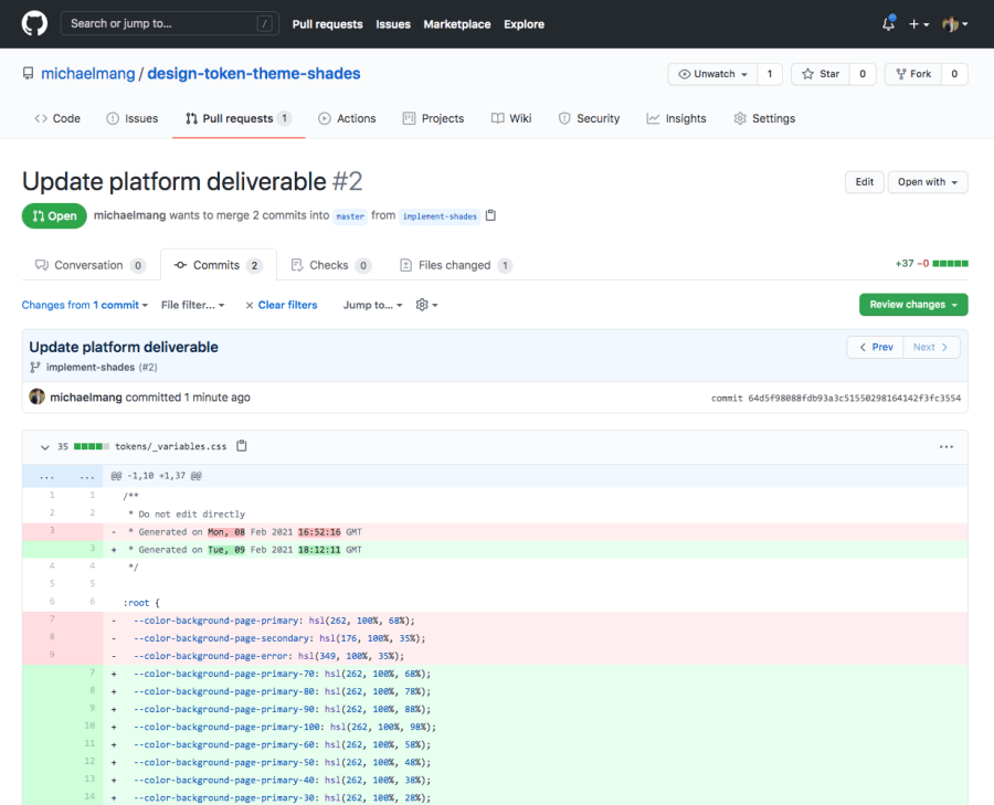
Once you’ve digested the code, push the changes to the branch.
With our GitHub Actions automation, we should see that the consuming application was delivered all of the theme shades!
Consuming Design Token Theme Shades
Now, we have an automated process of generating theme shades from a single color and delivering them to a consuming application.
From there, the consuming application can do whatever it wants with them. This could be used for having a list of potential color variants that may be used in an application.
Or, it can be used for toggling a broader spectrum of themes than the traditional “light” and “dark” themes.
The point of this article is to focus on how to generate design token theme shades with Style Dictionary and not to iterate through all the ways you could consume those theme shades.
However, I’ll provide a basic example to whet your appetite.
You can view the final code for my demo here:
https://github.com/michaelmang/design-token-theme-shades/pull/2
That’s all folks! 🎉
My next article will be on publishing a design documentation site using your design tokens.
Until then, pow, share, and discuss!

