Table of Contents
1 |
Introduction to Design Tokens
2 |
Managing and Exporting Design Tokens With Style Dictionary
3 |
Exporting Design Tokens From Figma With Style Dictionary
4 |
Consuming Design Tokens From Style Dictionary Across Platform-Specific Applications
5 |
Generating Design Token Theme Shades With Style Dictionary
6 |
Documenting Design Tokens With Docusaurus
7 | Integrating Design Tokens With Tailwind
8 | Transferring High Fidelity From a Design File to Style Dictionary
9 | Scoring Design Tokens Adoption With OCLIF and PostCSS
10 | Bootstrap UI Components With Design Tokens And Headless UI
11 | Linting Design Tokens With Stylelint
12 | Stitching Styles to a Headless UI Using Design Tokens and Twind
What You’re Getting Into
The genius of design tokens is that they encapsulate a design system in platform deliverables that can be consumed by applications across a variety of platforms and technologies.
This serves as a more agnostic and scalable solution than merely having a sharable CSS file and UI component library. The design tokens can be forged into sharable assets that make sense for every consuming application.
With that being said, it does not eliminate the usefulness of creating sharable UI components for specific technologies and platforms.
The key distinction to keep in mind is that it is the design tokens that are agnostic, not the sharable UI components.
Web components were birthed from an idea to make UI components agnostic to the complications of frameworks and build steps.
A noble experiment but not without drawbacks.
Web components are a classic example of “jack of all trades but master of none.”
True, they can be used in any JavaScript framework. However, there are not the same as HTML elements.
Web components often require additional code to get them to work.
They are agnostic across all frameworks, but they are also awkward across all frameworks. In some cases, this results in the creation of framework-specific wrappers around them.
Although the web components experiment is an experiment with mixed results, it is a noble experiment that drives us further to think of the ideal solution.
So, what is the ideal solution? What is the purpose of shareable web components? What is it that we are really after?
At the end of the day, there is a push for convenience. Specifically, a convenient way to satisfy two key desires.
First, there is a desire to encapsulate the specifications of a design system into UI components, resulting in a convenient way to maintain a consistent look across the elements of a UI.
Second, there is a desire to encapsulate a common functionality across all the elements of a UI, resulting in a consistent user experience without the strain of every application reinventing the wheel.
The transformation of design tokens into platform deliverables satisfies the first desire, but it fails to meet the needs of the second.
Web components attempt to satisfy both desires, but arguably, it is not the ideal solution for satisfying the second.
The reason being, it is easier to encapsulate design specifications in an agnostic fashion than functionality.
I do not know if there is a more ideal solution than using design tokens to encapsulate design specifications in conjunction with a UI component library that is specific to a particular platform and technology (i.e. a React component library).
The web components experiment does reflect a consciousness to a common issue, not enough time.
Web components attempted to reduce the need for every framework to have to create its own UI component library. As mentioned, this results in an awkward experience for every framework.
Writing a custom UI component library for every framework, on the other hand, is quite expensive. It would be ideal if every company had a focused team for a dedicated effort to handle this, but that is not always the case.
Hence, many teams utilize open-source UI component libraries such as Material UI.
Recall the distinction between encapsulating design specifications and encapsulating common functionality.
An option like Material UI gives you the latter but not the former. It encapsulates its own design specifications, requiring an initiative to overwrite all the default design specifications with your own design specifications.
This may be less costly than implementing all the UI elements with a common functionality yourself, but it is still costly. It is no small cost to have to maintain an override of an open-source UI library and not blur the lines between the default and custom specifications.
What if we could get the benefits of a framework-specific UI component library that encapsulates common functionality (so we don’t have to reinvent the wheel in we are in a bind) but does not encapsulate any design specifications?
I thought of this idea while watching The Great British Bakeoff on a Saturday morning. After a quick google search, it turns out that someone has beaten me to it.
In this article, I’ll talk about my discovery.
Headless UI
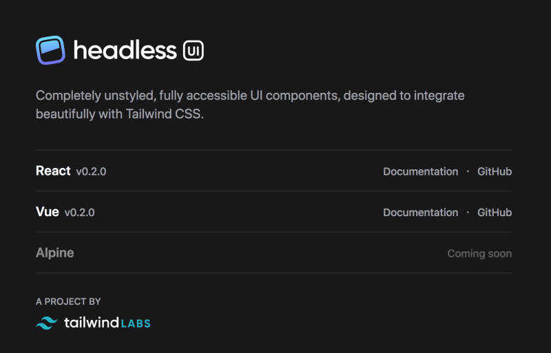
Headless UI comes from the Tailwind team, offering framework-specific UI components without any integration of design specifications.
Completely unstyled, fully accessible UI components, designed to integrate beautifully with Tailwind CSS.
Naturally, they suggest a pairing of Headless UI and Tailwind. However, this pairing isn’t forced.
Although it might be a decent pairing, given how we can easily integrate design tokens with Tailwind.
This seems to be exactly what I was getting at in the introduction. It provides the convenience of having already wired up all the functionality of common UI components yet without the costly addition of pre-existing styles.
A project like this, in my opinion, is the best way to bootstrap a UI component library for a company. It allows you to encapsulate your own design specifications without the overhead of writing existing ones. It also exposes the encapsulation of common functionality without the awkwardness of something like web components.
This project still is in early development and is missing many component components.
Admittingly, it may still be better to spend the effort to create custom UI component libraries for your company.
However, the concept of a “headless” UI is brilliant and would still be wise to follow even when making a custom solution.
The reason being, design specifications evolve and may even be torn down and built back up, but a headless UI can withstand such changes in the long-haul.
Paired with an automated pipeline of design tokens, a headless UI may be standard practice for the future. Time will tell.
Conclusion
I decided not to do any coding for this article since I don’t think the proposed pairing of design tokens and a headless UI is hard to envision if you’re familiar with a design tokens pipeline.
Hopefully, all these words will help drive better solutions for the future of UI development.
As always, pow, discuss and share. Cheers.

