In the previous article, I walked through creating a basic SVG. In this article, I will pick up where we left off and explore SVG animations.
Whereas bitmap/raster graphics are composed of individual pixels, vector graphics are composed of individual shapes.
This provides for the ability for vector graphics to scale without loss of quality as they can render clearly at any resolution.
There is another benefit, however, to SVGs being composed of individual shapes. Each shape can be styled as we desire.
Since each shape in a SVG can be styled, this gives us the ability to create animated graphics on the web.
Animating SVGs: A Basic Example
I’m going to be modifying the SVG we created in the former article.
Currently, we have the follow markup that creates our SVG:
<svg
  viewBox="0 0 400 400"
  xmlns="[http://www.w3.org/2000/svg](http://www.w3.org/2000/svg)"
/>
  <circle cx="50%" cy="50%" r=25% />
  <circle cx="50%" cy="50%" r=10% />
</svg>
We are styling the circle elements in our CSS:
svg {
  height: 400px;
  width: 400px;
}
circle {
  &:first-child {
    fill: #FDC56B;
    stroke: #3E829B;
    stroke-width: 20;
  }

  &:last-child {
    fill: #D45F5B;
  }
}
Let’s try animating these circles using CSS animations.
First, we can define our keyframes animation:
[@keyframes](http://twitter.com/keyframes) fade-in {
  from {
    fill-opacity: 0;
  } to {
    fill-opacity: 1;
  }
}
Whenever this animation is assigned, the fill will go from an opacity of 0 to an opacity of 1 (we could omit the to since fill-opacity: 1 is the implicit default).
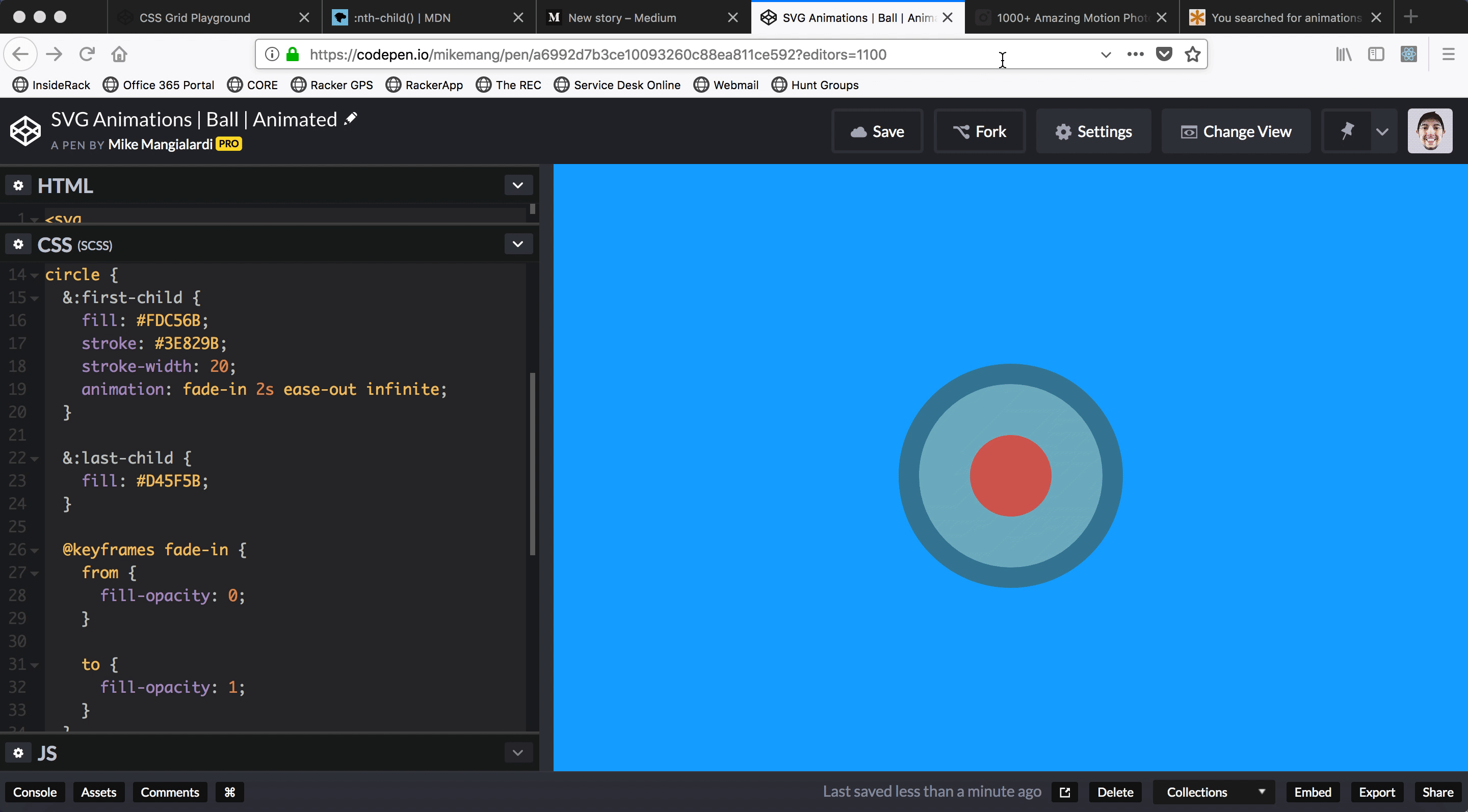
Let’s assign this animation to the outer circle:
circle {
  &:first-child {
    fill: #FDC56B;
    stroke: #3E829B;
    stroke-width: 20;
    animation: fade-in 2s ease-out infinite;
  }

  &:last-child {
    fill: #D45F5B;
  }

  [@keyframes](http://twitter.com/keyframes) fade-in {
    from {
      fill-opacity: 0;
    }

    to {
      fill-opacity: 1;
    }
  }
}
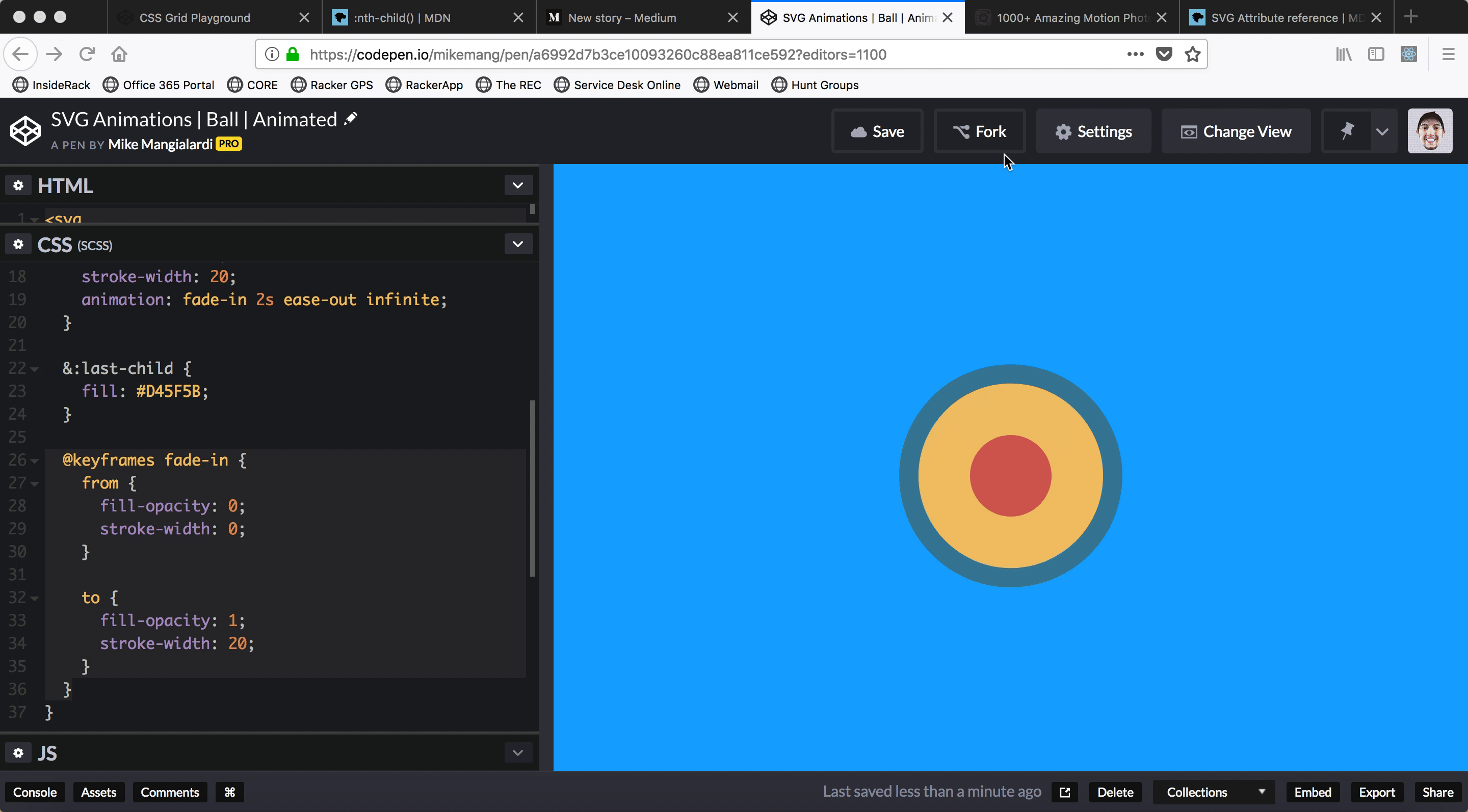
We’ve animated fill, but we can also animate any SVG attribute.
Let’s try animating the stroke-width as well:
[@keyframes](http://twitter.com/keyframes) fade-in {
  from {
    fill-opacity: 0;
    stroke-width: 0;
  }

  to {
    fill-opacity: 1;
    stroke-width: 20;
  }
}
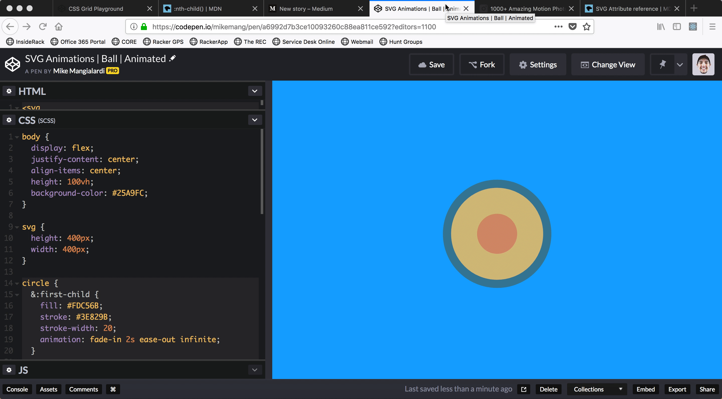
Finally, we can apply this animation to the innermost circle with slightly different timing:
circle {
  &:first-child {
    fill: #FDC56B;
    stroke: #3E829B;
    stroke-width: 20;
    animation: fade-in 2s ease-out infinite;
  }

  &:last-child {
    fill: #D45F5B;
    animation: fade-in 2s ease-in infinite;
  }

  [@keyframes](http://twitter.com/keyframes) fade-in {
    from {
      fill-opacity: 0;
      stroke-width: 0;
    }

    to {
      fill-opacity: 1;
      stroke-width: 20;
    }
  }
}
That’s it! You can view the final pen here. 🚀
Practical Application
So, we’ve gone over animating attributes on a SVG using CSS animations to create a basic animation.
There’s a whole host of dazzling animations you can make with SVGs using more advanced animation principles and technology:
Additionally, you might be wondering how a SVG can be of use in a typical business web application.
In spirit of not reinventing the wheel, I will simply link you to this fantastic post by Sarah Drasner which exemplifies some SVG animations that might go into UX design. If you want to go one step further into mastering SVG animations, I highly recommend Drasner’s book SVG Animations.
Thanks for reading, pow, discuss, and share 😃

